Studio

Inkwork

A styled-QR studio, and what it took to get from working to good.

Inkwork project visual

Designed, built, and shipped · Live at malikzhang.com/inkwork · Press the cube.

Intro

From working to good

Inkwork is a small studio for styled QR codes: type your link, pick a style, check the proof, export. This case study is about the harder half of building it, the part that takes a product that works and gives it a point of view.

I wanted to generate a QR code in seconds and have real control over how it looked. Most generators give you one or the other: instant but ugly, or styleable but buried in settings.

Working with Claude Code, I had a functional version fast: sixteen style presets, logo embedding, preset import and export, shareable links, print-quality export, and a scannability check that actually decodes the code you just made. Everything worked.

It just hadn’t decided what it was.

Role

Design · Build · Ship

Timeline

Summer 2026

Stack

React + Vite · qr-code-styling · Vercel

Output

Live Product · Two Themes · Product Film
Diagnosis

One unmade decision, showing up in six places

Version one looked fine at a glance: warm off-white ground, monospace helper text, crop marks around the preview. But the closer I looked, the more the same problem kept surfacing in different costumes.

Version One, as Shipped

01

Two Primary Buttons, One Intent

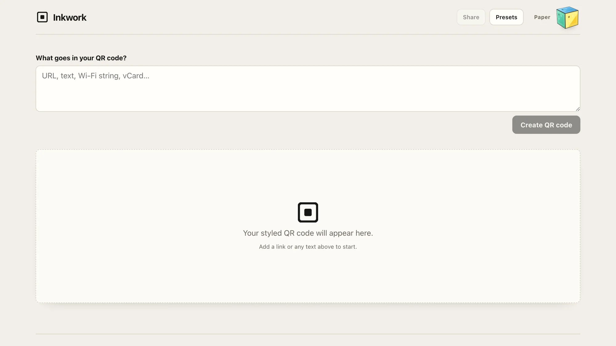
A black “Download PNG” next to an indigo “Download SVG,” identical weight. The accent color then reappeared on “Copy share link,” marking two unrelated things and meaning nothing.

02

Every Card Weighed the Same

Content, preview, Share, Preset I/O, and Print export all sat at identical elevation. Print PDF at 40mm, a power-user feature, was as prominent as the one thing everyone came to do.

03

A Promise the Layout Didn’t Keep

“Pick a preset, tune the ink, export,” but the page opened on a textarea, an error-correction dropdown, and two hex fields. The presets weren’t where the eye landed first.

04

Two Voices on One Screen

“Module color” and “Error correction · L · ~7%” were library internals leaking through, sitting next to “Center logo” and “tune the ink,” which is the voice I actually wrote.

05

The Default Fought the Brand

A magenta-on-pink code inside indigo-and-ink chrome. The largest element on the page told a color story that appeared nowhere else.

06

The Logo, Three Times

Repeated as a section icon, carrying no information.

None of these is a visual problem. You can’t fix any of them with better spacing or a nicer shadow. They’re all the same missing decision: what is the primary thing a person does here, and in what voice does this product speak?

Once that’s undecided, the symptoms follow automatically. No primary action decided means both download buttons get primary styling. No priority decided means every panel gets the same card. No voice decided means library internals sit next to my own writing.

The Decision

A style picker, not a control panel

Inkwork is a style picker, not a control panel. Everything in the redesign follows from that one sentence.

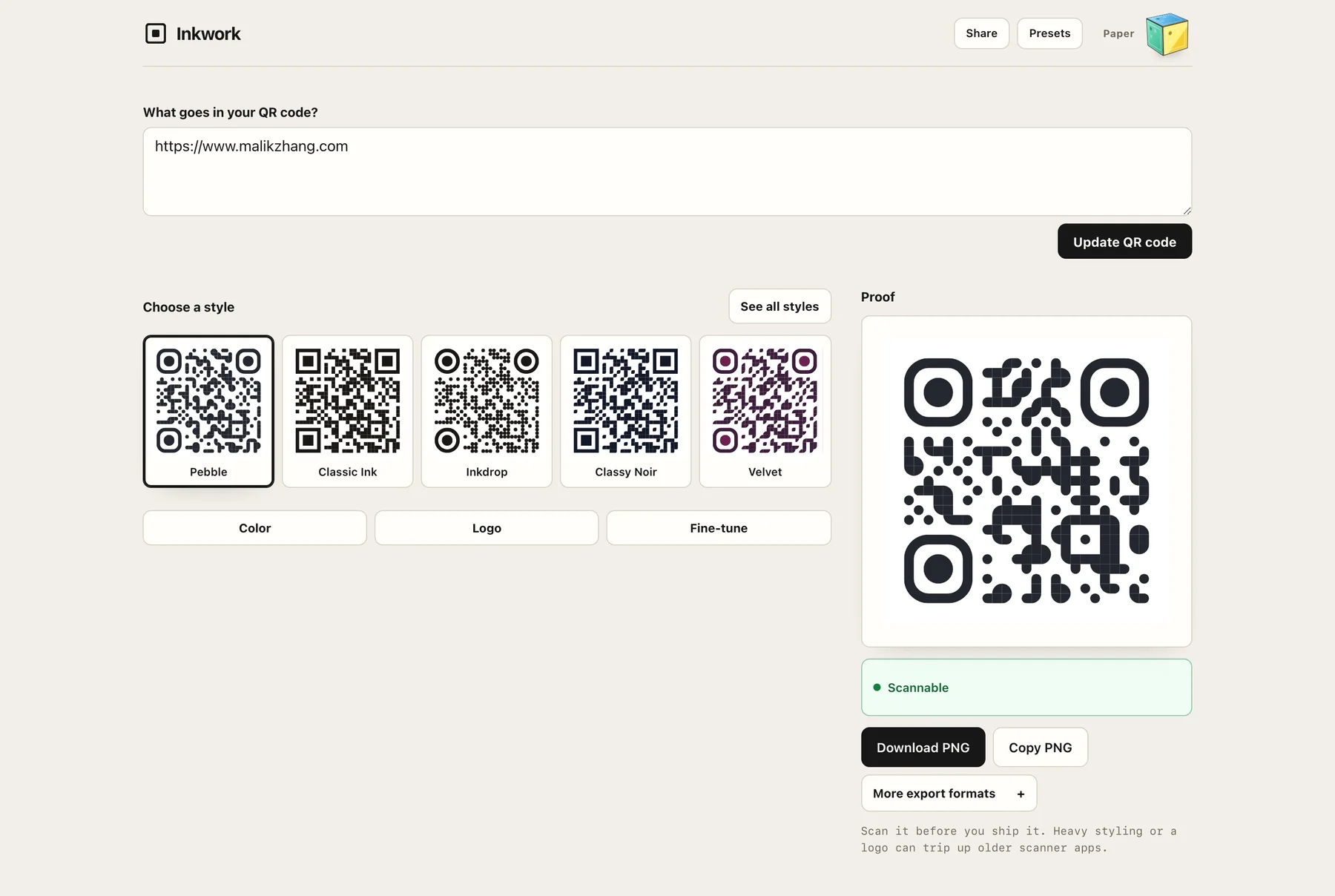
Inkwork after the redesign: one content field, one Update QR code button, named style tiles, and a proof panel with a single primary download
Version two: one field, one primary action, the styles moved to the front, and everything else behind a button

The Page Became a Sequence, Not a Dashboard

One primary action per stage: a single “Update QR code” button after the input, a single primary “Download PNG” at export, with “Copy PNG” as the quiet secondary.

01

Type Your Link

One field, one “Update QR code” button.

02

Pick a Style

Named presets as first-class tiles: Pebble, Classic Ink, Inkdrop, Classy Noir, Velvet.

03

Check the Proof

A scannability check that decodes the code you just made.

04

Export

One primary “Download PNG”; “Copy PNG” as the quiet secondary.

The Styles Moved to the Front

“Choose a style” now sits immediately after the content field, with named presets as first-class tiles. This is what the old subtitle always promised and the old layout never delivered, and it is the actual reason to use Inkwork over any other generator.

Everything Else Waits Behind a Click

Color, Logo, and Fine-tune sit behind buttons. Print formats collapsed into “More export formats.” Share and Presets moved to the header, where features for returning users belong. Textbook progressive disclosure, but the point isn’t the pattern. The pattern only became applicable once the decision existed: you can’t defer “secondary” controls until you’ve decided what’s primary.

One Voice

“What goes in your QR code?” instead of “Content.” The library internals moved inside Fine-tune, where the people who want them will look for them.

Two Themes

Then I gave it a personality. Two, actually.

Once the product knew what it was, it could afford to have moods.

01

Paper

Calm cream and ink. The studio at rest.

02

Arcade

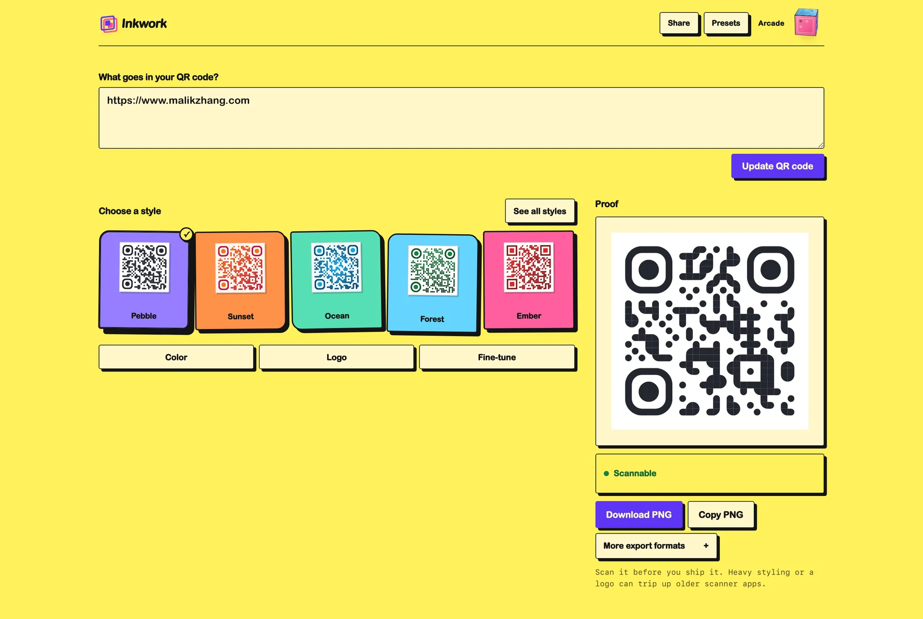
Loud yellow neubrutalism: hard shadows, thick borders, and a 3D cube in the corner that flips between the two.

03

One Token System

The themes differ in every surface quality and share every structural decision. The cube is the proof the system is real, not two hand-painted skins.

The same Inkwork page in the Arcade theme: yellow ground, hard shadows, thick borders, and the same layout
Arcade: every surface quality changes and every structural decision stays

One token system drives both. That constraint was the real design exercise: the themes had to differ in every surface quality, in color, shadow, corner treatment, and energy, while sharing every structural decision. If the hierarchy was right, it would survive the costume change. It did.

The Film

Automation that carries judgment

The product film above was made by an agent skill I wrote in Claude Code. It produces product films across five surfaces: title and end cards, the edit, camera energy, animation, and soundtrack. Brand identity flows in through configuration. It has engineering gates it won’t cross: measure before trimming, splice whole animations, verify frames, audit gaps, no watermarked audio. Along the way I built my own ScreenCaptureKit-based recorder after the macOS default stalled on writes mid-capture.

The skill didn’t make any of the design decisions above. That’s the point. It encodes my direction so the decisions I make survive into everything I ship, applied the same way every time.

Automation that replaces judgment produces the sameness this whole project was a reaction against. Automation that carries judgment is just leverage.

Reflection

What I took from this

AI got me from idea to working product fast. Getting from working to good took taste, judgment, and a lot of rebuilding. I think that gap is now the most interesting place to work in product design. The generation cost of “functional” is approaching zero. What that raises, rather than lowers, is the value of being able to look at a functional thing and articulate precisely why it isn’t good yet.

The transferable habit: when a design has many small problems, resist fixing them one by one. Ask what single unmade decision is producing all of them. Fix that, and most of the symptoms resolve themselves.

Next up

Oryne

0→1 Product Designer & Builder · 2026App Store
AI-NativeMotion DesignDesign Engineering

Locant

0→1 Product Designer & Builder · 2026GitHub
AI-NativeDesign Engineering

NeuraLyfe

Product Designer, Maker · 2026
Data VisualizationAI-NativePhysical Prototyping